Chart Data for cases, deaths, vaccinations from "Our World in Data" Mathieu, E., Ritchie, H., Ortiz-Ospina, E. et al. A global database of COVID-19 vaccinations. Nat Hum Behav (2021) Code for this post here.
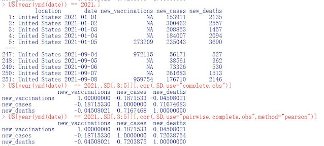
The long term data for US Covid-19 daily vaccinations, deaths and cases *is scaled* and plotted below in a seven day rolling average. A table of the R language correlation coefficient (using 'cor' which is scaled 1 to -1) is far below. The table and visual inspection reveal a fairly strong correlation between daily Covid cases and daily Covid deaths. For 2021 only, US Covid daily vaccinations have a correlation coefficient with both cases and deaths close to '0'. This would indicate no correlative relationship between daily vaccinations with either daily cases or daily deaths.
In the second chart, three overlay rectangles represent three distinct and separate temporal relationships between daily vaccinations and daily cases/deaths over the course of the pandemic:
- The green rectangle graphs daily vaccinations increasing while daily cases/deaths decrease.
- The purple rectangle graphs daily vaccinations decreasing while daily cases/deaths continue to decrease.
- The blue rectangle graphs daily vaccinations increasing while daily cases/deaths increase.


No comments:
Post a Comment
Moderated Comments: Be polite and quantitative in your remarks. Just because I am not always so doesn't mean you will get your commentary published.